
Gym wayfinding screens work when each one has a single job, sits where a member actually hesitates, and updates itself from the same schedule your front desk uses. A screen at the door of Studio 2 should say what is running, when it ends and what is next. A screen at the lobby should say where to go first. Run all of them from one dashboard and a room change takes one edit instead of a walk around the building with a marker. That is how we build Kingdom Signage: one place to control screens, class information and announcements across rooms and locations.
This guide is for gym owners, studio managers, instructors and the person who ends up in charge of the TVs. It covers where to place screens, what each one should show, how to make directions readable for every member, and how to keep everything accurate without extra work.
TL;DR
- Give every screen one job: arrival and direction in the lobby, current and next class at studio doors, simple route guidance in hallways and locker areas.
- Place screens at decision points, the spots where members stop and ask "where do I go?", not on the biggest empty wall.
- Feed schedules and room names from one source so the screen, the door sign and the booking system never disagree.
- Use plain language, high contrast, large text and icons, and keep any touch controls within reach of a seated member.
- Manage every room and location from one dashboard so a room change or announcement reaches all screens at once.
Table of Contents
- What a gym wayfinding screen actually does
- Where to put wayfinding screens
- What each screen should show
- Making directions readable for every member
- Keeping screens accurate without daily edits
- Coordinating several rooms and locations
- What you need to run this well
- A staged plan for your gym
- Run your wayfinding from one dashboard
- FAQ
- Sources
What a gym wayfinding screen actually does
Traditional wayfinding is a set of printed signs: arrows to the locker rooms, a laminated schedule on the studio door, a sticker for the stretching area. They are cheap and they go stale. The moment a class moves rooms, the sign is wrong, and the front desk becomes the correction service.
A wayfinding screen replaces that with live information. It answers the questions members ask staff all day:
- Where is my class, and has it started?
- Which room is this, and what is happening in here after this session?
- Where are the locker rooms, the turf area, the stretching zone, the childcare room?
- Is something closed or moved today?
Notice that none of these needs a fancy interactive map. For most gyms and boutique studios, wayfinding is mostly clear, current text in the right place. If you can get that right, you have solved most of the confusion that new members feel in their first weeks, which is when they decide whether the place feels like theirs.
Where to put wayfinding screens
The common mistake is to start with the wall space and ask what to hang on it. Start with the member's path instead.
Walk the building as a first-time member would, from the parking lot to the front door to the first workout. Every time you would hesitate, or see someone else stop and look around, mark the spot. Those decision points are your screen locations. They are often better than a large empty wall, because a screen only helps when it is in the line of sight at the moment of doubt.
The entrance and front desk
This is the orientation screen. Members arrive here unsure, and the front desk is where congestion forms. Show today's classes rather than the full week, with start times and rooms, plus a short welcome or announcement. Today's list is faster to scan than a seven-day grid, and it keeps people from queuing just to ask what is on at 6 p.m.
The arrival moment is also a workflow, not only a display. Thinking through the sequence a visitor follows from the door to being greeted and directed, as in this guest check-in workflow written for hotels, helps you decide what the entrance screen needs to say and in what order. Our own piece on front desk signage essentials goes deeper on cutting lobby confusion.
Studio doors
This is the screen with the highest payoff. Outside each studio, show three things: the class in progress, when it ends, and what is next. Add one line of entry guidance, for example whether late entry is allowed or whether members should wait for the current class to clear. Keeping the room name on the screen identical to the name on the booking system matters more than any design choice. If the app says "Studio B" and the door says "Cycle Room," members will believe neither.
Do not put membership offers here. A door screen with a job stays glanceable, and a promotion competing with the class name makes members read twice. Offers belong on a lobby or lounge screen. We cover how to do that without crowding out the schedule in our guide to how membership offers display digitally.
Hallways, locker rooms and junctions
This is where direction matters. Use a screen at the point where the corridor splits: left for locker rooms, straight for studios, right for the weight floor. Portrait orientation often suits narrow corridors. Keep the message to a few words and an icon per destination.

The floor and lounge
On the main floor, screens serve a different purpose: workout timers, demo videos, and the next class announcement. They are less about getting someone from A to B and more about keeping members informed while they train. A lounge screen is the place for longer content, such as promotions, events and community news.
Where not to put them
A few placement failures waste money. Avoid walls opposite windows that catch afternoon sun, because glare turns text into a mirror. Avoid spots behind weight racks where a loose plate could hit the display. Keep standard displays out of steam and wet areas, and choose commercial models rated for the environment if a screen has to go near a pool or sauna corridor. And do not mount screens behind cardio equipment, where members face away from them. Before drilling anything, stand at the intended spot at different times of day and check the sight lines.

What each screen should show
A useful way to plan is a one-line job description per screen. If you cannot write it, the screen will end up showing a bit of everything and helping nobody.
| Location | Job | What to show |
|---|---|---|
| Front desk or entrance | Orient arriving members | Today's classes with rooms, welcome message, key announcements |
| Studio door | Confirm the room | Current class, end time, next class, one line of entry guidance |
| Hallway junction | Direct movement | Destinations with arrows and icons |
| Locker room approach | Direct movement | Clear icons, short labels, closures or changes |
| Main floor | Support training | Timers, exercise demo videos, next class reminder |
| Lounge | Inform and promote | Offers, events, community news |
Three habits keep this table working over time.
Give the schedule a fixed place. Members learn where on the screen to look. If the schedule rotates between ads, they wait for it to come around, and then they ask the desk. Our examples of studio class schedule displays show ten layouts that keep the timetable in a predictable spot.
Show less, not more. Outside a studio, the current and next session matter far more than the full week. When a class changes rooms, the correction should be the first thing a member sees, not the last item in a playlist.
Use the room's name once, everywhere. Pick the official name of each space and use it on the door, in the booking system, on the screens and in staff conversation.
Making directions readable for every member
A wayfinding screen that some members cannot read or reach is a screen that fails its job. In the United States, accessibility is also a legal matter for public-facing businesses, so it is worth getting the basics right at the start. The guidance below comes from government and university sources; for questions about your specific obligations, talk to a qualified ADA consultant or attorney.
Language and layout
The federal Section508.gov guidance on cognitive accessibility recommends plain, straightforward language, content in manageable sections, consistent layouts, and recognizable icons with descriptive labels. It also advises captions and transcripts for video, and avoiding flashing or distracting animation. For a gym that translates into:
- Short labels: "Locker rooms," not "Member changing and wellness facilities."
- The same layout on every door screen, so members learn it once.
- An icon and a word together, never an icon alone.
- Captions on demo videos, since gym floors are loud and many screens run muted.
- No spinning, flashing or sliding text on screens that give directions.
Directions people can follow
The W3C Web Accessibility Initiative's supported wayfinding pattern is written for digital navigation, but its ideas carry over to a building. It recommends easily recognized landmarks, directions tied to fixed objects, step-by-step instructions and the option to preview a route. It also warns against fine compass points and against instructions that assume the person is already standing where you expect. In a gym that means "Turn left at the front desk, the studios are through the glass doors" beats "Studios north." And a hallway screen should work for someone arriving from either end of the corridor.
Reach and touch
If you add any touch screen or interactive directory, Utah State University's kiosk and interactive display accessibility guidance says controls should sit within accessible reach, typically no more than 48 inches above the floor, with clear floor space in front, large well-spaced touch targets and support for alternative input. Mount any interactive element lower than you instinctively would, and leave room for a wheelchair or mobility aid to approach.
Passive screens that only display information do not need to be touched at all, which is one more reason to keep most wayfinding simple. Contrast, text size and viewing distance still matter: a member standing six feet from a door screen should read the class name without squinting.
Keeping screens accurate without daily edits
Placement and design are one-time decisions. Accuracy is the daily one, and it is where most gym signage projects quietly fail. A screen that shows yesterday's room is worse than no screen, because members trust it.
The fix is a single source of truth. Decide where the schedule lives, whether in your booking software or in the signage platform, and make every screen read from it. Then three things hold:
- Room names are identical everywhere. Screens, door signs and booking all use the same labels.
- A change is made once. Moving a class from Studio 1 to Studio 2 updates every relevant screen, rather than the lobby, the studio doors and the group chat separately.
- Temporary changes have a fast path. A closed locker room, a detour around construction or a special event layout should be an announcement you can push in a minute, not a design project.
This is the daily reality for instructors too. They need the screen at their studio door and the timer inside the room to agree with each other, so transitions between classes feel smooth rather than improvised. If you are setting this up from scratch, our walkthrough on how to set up gym digital signage covers the sequence from first screen to full coverage.
Coordinating several rooms and locations
Once you have more than two or three screens, the work stops being about any single display. It is about coordination: the lobby, the studio doors, the floor and the music in each room should all agree about what is happening now.
Here is what that coordination needs in practice:
- One dashboard for all rooms. Staff should not log in to a different tool for the lobby, the cycling studio and the second location.
- Room-based content. Each room shows what is relevant to it, while shared announcements reach all of them.
- Audio that follows the room. If the yoga studio is mid-class, the music there should be different from the HIIT room next door, and a class transition should change both sound and screen together.
- Real-time announcements. A message about a cancelled class or a closed area should appear on the screens where members will see it, immediately.
- Multi-location control. For owners and franchise managers, the same structure should extend across sites, with each location keeping its own schedule and branding where needed.
This is the problem Kingdom Signage was built around. Our platform brings TVs, class schedules, workout timers with demo videos, room-based music and real-time announcements into a single dashboard, and it handles multiple rooms or multiple locations from the same place. It works with your existing screens, so coordination does not start with replacing hardware. For the bigger picture of what consistency across sites involves, see our multi-location digital posters playbook.
What you need to run this well
You do not need a technology department. For a boutique studio or a single gym, the practical list is short.
Screens. Existing TVs are often enough. Choose sizes that suit the viewing distance: larger in the lobby and lounge, smaller by studio doors and in corridors, and portrait where the space is narrow. If budget is tight, our guide to affordable screens in small gyms shows how to start with the screens that matter most.
A reliable network connection at each screen location, so updates arrive when you make them.
A platform that manages content by room. The test is simple: can a front desk employee change a class's room and see the right screens update, without calling anyone?
An owner for the content. Someone, whether the studio manager, marketing lead or head instructor, should be responsible for room names, announcements and the weekly check. The best system still needs one person who notices when something looks off.
A short routine. Once a week, walk the route again. Read each screen as a new member would. Check that the room names match, nothing is blocked by new equipment and the text is readable from where people actually stand.
A staged plan for your gym
You do not have to cover the whole building in a week. A sensible order:
- Map the route and mark the decision points.
- Standardize room names across the booking system, door signs and staff vocabulary.
- Start with the front desk and the busiest studio door, the two places where confusion is most visible.
- Add hallway junctions and locker approaches once the first two are stable.
- Add floor and lounge screens for timers, demos and promotions. Our look at how displays shape gym atmosphere helps with that last layer.
Each stage pays off by itself, so you can stop and measure how many questions the front desk still gets before you invest further.
Our view: wayfinding is a scheduling problem
Most gyms treat wayfinding as a sign problem and shop for screens. We see it as a coordination problem. Members get lost when the information they see, on the door, on the app and in the staff's heads, is not the same information.
That is why we built Kingdom Signage around one dashboard. When screens, class schedules, timers, music and announcements are controlled together, a room change is a single action, and a class transition feels deliberate: the door screen, the room's screen and the audio move together.
We also think a gym should not have to replace its hardware to get there. Working with the screens you already own, across as many rooms and locations as you run, keeps the focus where it belongs: members who know where to go and feel looked after from the first visit.
Kingdom
Run your wayfinding from one dashboard
Kingdom Signage is a subscription platform for gyms and fitness studios. It gives you unified control of digital signage, TV screens, class scheduling, workout timers with demo video support, room-based music and real-time announcements, across multiple rooms and locations. You can start with a free trial or demo and see your own rooms and schedule on screen.
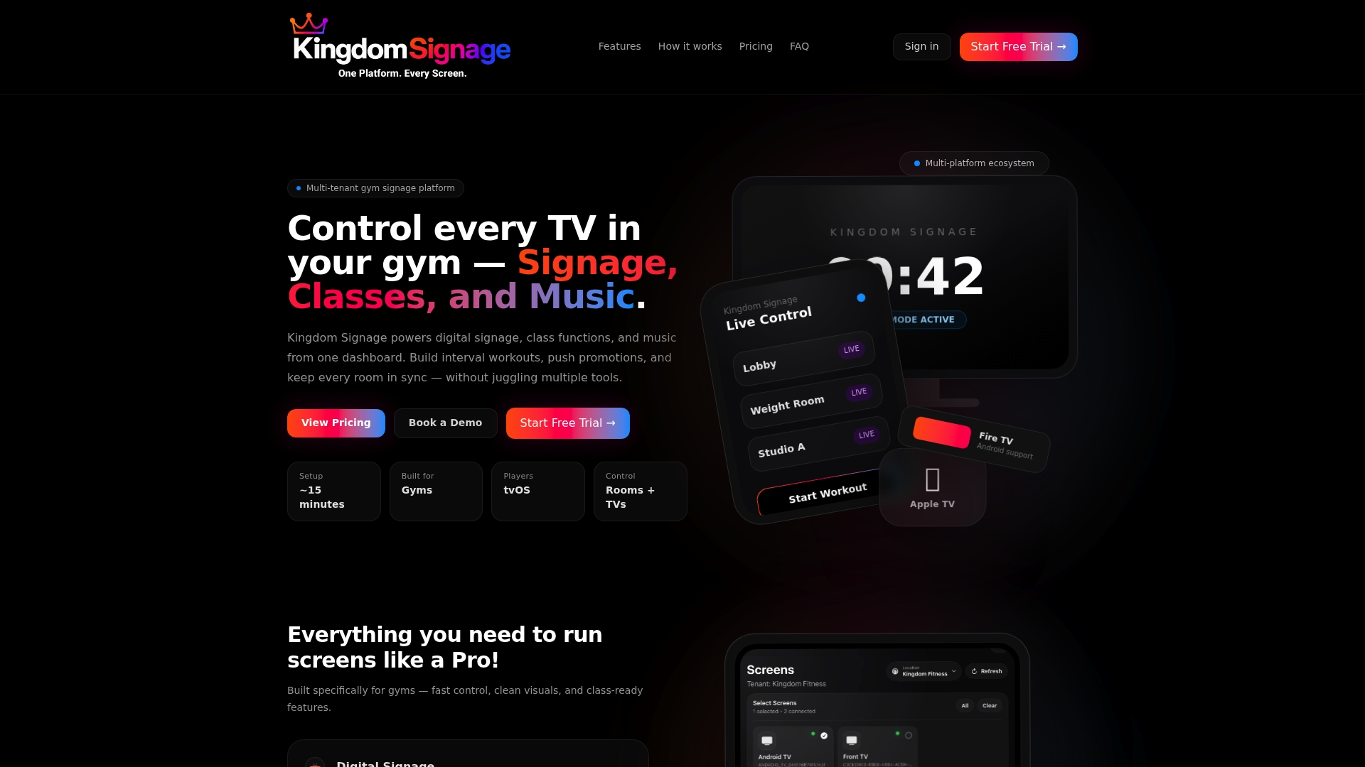
If you want wayfinding that stays accurate without a daily chore, see how it works at Kingdom Signage.
FAQ
Do gym wayfinding screens need to be interactive?
No. Most gyms get the biggest gains from passive screens that show the right information in the right place: today's classes at the desk, current and next class at studio doors, and clear directions at junctions. If you add a touch directory, keep controls within accessible reach, typically no more than 48 inches above the floor.
How many screens does a small studio need?
Start with two: one at the entrance or desk and one at the busiest studio door. Those cover the moments when members are most unsure. Add corridor and floor screens as you see where people still stop and ask for help.
What should a studio door screen show?
The class in progress, its end time, the next class and one line of entry guidance. Keep the room name identical to the name used in your booking system. Leave promotions for the lobby or lounge, so the door screen stays quick to read.
How do I keep screens correct when classes move rooms?
Manage the schedule in one place and have every screen draw from it, so the change is made once. Pair that with a fast way to push an announcement for temporary closures. A weekly walk-through catches anything that slipped.
Sources
- Section508.gov: Designing digital content for users with cognitive disabilities
- W3C WAI: Provide help with directions (supported wayfinding pattern)
- Utah State University: Kiosk and interactive display accessibility
- Guest check-in process workflow guide