
Start by picking the two or three languages your membership and staff actually speak, pair every translated line with a clear pictogram, meet ADA tactile requirements on permanent signs, and choose printed or digital delivery based on how often the message changes. OSHA offers free multilingual safety posters, and a gym-tailored digital signage platform like Kingdom Signage can handle the rest.
TL;DR:
- Rank signs by consequence: evacuation routes come first, followed by equipment and chemical hazards, then pool rules and wayfinding that affects member experience more than safety.
- Keep each sign to one clear pictogram and translated phrases, then size lettering for viewing distance at roughly one inch per 25 to 30 feet.
- Test signs with six to ten bilingual people outside design; ask what action they infer, since icon confusion requires redesign, not wording changes.
- OSHA does not mandate translated notices, but chemical and equipment labels must remain legible in English, while local fire or health codes may add rules.
- Use printed signs for stable rules; gyms with frequent class changes or multiple locations can update language specific digital screens without repeated print runs.
Table of Contents
- Which Languages and Messages Should You Translate First?
- What Design Rules Actually Improve Cross-Cultural Comprehension?
- What Does OSHA and ADA Actually Require?
- Printed, Vinyl, or Digital: How Should You Deliver Multilingual Signs?
- How Kingdom Signage Supports Multilingual Messaging in Gyms
- Where Should Signs Be Placed and How Big Should Text Be?
- How Do You Test Whether a Sign Actually Works?
- What Local Rules Go Beyond OSHA and ADA?
- How Do You Keep Multilingual Signage in Sync With Your Digital Systems?
- How Do You Keep Signage Current as Your Membership Changes?
- A Manager's Take on Inclusive Signage
- Ready to Pilot Multilingual Signage With Kingdom Signage?
- FAQ
- Sources
Which Languages and Messages Should You Translate First?
Before you print or program a single sign, figure out which languages matter at your location and which messages carry the most risk if misunderstood.
Pull your top languages from three places: membership sign-up forms (many CRMs capture a preferred language), front-desk staff observations of who asks for help, and the languages your own team speaks fluently enough to proofread. You don't need a translation for every language in your zip code, just the two or three that show up repeatedly.
Once you know the languages, rank your existing signs by what happens if someone misreads them:
- Emergency exits and evacuation routes, because a delay here has the highest safety cost.
- Safety procedures around equipment, pools, and hazardous areas like cleaning chemical storage.
- Equipment instructions for machines that can injure someone if used incorrectly.
- Pool, sauna, and locker room rules, since these often carry health code weight.
- Front-desk and wayfinding signs, which affect member experience more than safety.
Walk the floor with this list, count how many signs fall into each category, and you'll have a short, defensible priority order instead of a guess.
What Design Rules Actually Improve Cross-Cultural Comprehension?
Translation alone doesn't guarantee understanding. A 2026 study in Universal Access in the Information Society redesigned prohibition safety signs using what researchers call the compatibility principle: aligning the pictogram, color, and layout with how people instinctively read danger and restriction, rather than relying on text to carry the meaning.
Redesigns substantially improved comprehension among non-native viewers, because intuitive icons are processed faster than text in an unfamiliar language (Springer, 2026).
Apply the same logic to your gym signs with a short checklist:
- Use one clear pictogram per message, not a cluster of symbols competing for attention.
- Limit translated text to short phrases, ideally five words or fewer per language.
- Keep layout, color, and contrast consistent across every language version of the same sign.
- Size text for the viewing distance: a general rule is one inch of letter height per 25 to 30 feet of expected reading distance.
- Reserve icon-only signs for universally recognized symbols (fire exit, no smoking) and add short text only when the icon alone is genuinely ambiguous.
Pro Tip: Draft the pictogram first and treat the translated text as a caption, not the other way around.
Common pitfalls include translating idioms literally, cramming four languages onto one small sign until none of them are readable, and skipping a native-speaker proofread, which lets awkward phrasing slip through even when the grammar is technically correct.
What Does OSHA and ADA Actually Require?
Federal rules split into two categories: strongly encouraged and legally mandatory, and conflating them leads to either wasted effort or compliance gaps.
OSHA does not require you to post safety notices in a language other than English, but the agency encourages employers to post additional-language versions whenever workers or members may not read English well. There's no fixed threshold of non-English speakers that triggers the requirement; it's framed as good practice, not a citation risk. OSHA also provides its Job Safety and Health poster as a free multilingual download, so there's no reason to pay a third party for one.
The Hazard Communication Standard works differently: chemical and equipment labels must stay legible in English, and other languages can be added alongside, not instead of, the English version.
ADA compliance is non-negotiable for permanent signage. The 2010 ADA Standards require tactile and Braille characters on permanent room identification signs, with specific mounting height ranges, regardless of how many spoken languages appear on the sign.
A short compliance checklist:
- Keep one English master copy of every required notice on file.
- Add translated versions alongside, never in place of, the English original.
- Verify tactile and Braille elements meet ADA mounting specs on every permanent sign.
- Loop in legal or accessibility counsel for anything touching fire codes or health permits.
Printed, Vinyl, or Digital: How Should You Deliver Multilingual Signs?
The right delivery method depends on how often the message changes, not on which one looks nicer.
Printed and vinyl signage works best for static messages: exit routes, permanent room labels, pool rules. Laminate anything near water or heavy humidity, and size lettering for the distance members will actually stand when reading it. Vinyl decals hold up well on glass doors and mirrors where a frame would be impractical.
Digital signage earns its cost in gyms with multiple rooms, frequent class changes, or more than one location, since it eliminates repeated print runs and lets you schedule different languages at different times without reprinting anything. It also lets you sync audio announcements in a target language with what's shown on screen, which matters for busy group fitness areas.
A short rollout checklist to pilot either approach:
- Inventory every existing sign and sort by message type and urgency.
- Prioritize translations using your language and risk ranking.
- Translate and proofread with a native speaker, not just a translation app.
- Pilot on two or three high-traffic signs before a full rollout.
- Measure comprehension with a quick staff or member check.
- Scale to the rest of the facility once the pilot signs test well.
Our front desk signage guide covers wayfinding specifics if your pilot starts at the entrance, and our cost-effective signage features breakdown can help you compare printed and digital spend before committing.
How Kingdom Signage Supports Multilingual Messaging in Gyms
We built Kingdom Signage around the reality that gyms run multiple rooms, multiple classes, and increasingly multiple languages at the same time, and that juggling separate tools for TVs, music, and announcements makes consistent multilingual messaging harder than it needs to be. The dashboard gives you one place to schedule language-specific content across every screen and room, syncing audio and visuals so a Spanish-language safety alert or a translated equipment demo plays exactly where and when you need it.
Practical ways gym operators use this:
- Run language-specific emergency alerts that trigger across all connected screens at once.
- Loop translated equipment demo videos on screens mounted near the machines they explain.
- Display a rotating multilingual welcome message at the front desk during peak sign-in hours.
If you want to test this before a full rollout, set up two or three screens in your highest-traffic area, schedule messages in your top two languages, and run the same quick comprehension check described above with staff and members. Our guide to setting up gym digital signage walks through the setup steps in more detail.
Where Should Signs Be Placed and How Big Should Text Be?
Placement and sizing determine whether even a well-translated sign gets read at all.
For wall-mounted signs along walkways, eye level for a standing adult generally falls between 57 and 65 inches to the sign's center, which keeps text readable without forcing anyone to look up or down. ADA tactile room identification signs have their own baseline, with tactile characters placed roughly 48 to 60 inches from the finished floor under the 2010 ADA Standards, and that spec holds regardless of how many languages appear on the sign.
Readability distance drives letter height. A commonly used rule of thumb is roughly one inch of capital letter height for every 25 to 30 feet a reader stands from the sign, scaling down proportionally for closer signage like equipment labels read from arm's length. A sign mounted above a squat rack that members read from six feet away needs much smaller text than an exit sign meant to be legible from across a weight room.

Placement also affects which language goes where. If your membership skews toward one non-English language in group fitness classes but another near the pool, it's reasonable to weight sign placement by where each language group spends the most time rather than treating the whole facility uniformly. Equipment instruction signs belong at the point of use, mounted where a member's eyes naturally land before touching the machine, not on a nearby wall where it's easy to miss.
How Do You Test Whether a Sign Actually Works?
Before printing a hundred copies or pushing a design to every screen in the building, run a small comprehension check.
Show the draft sign to six to ten bilingual staff members or members who weren't involved in designing it, and ask them to describe, in their own words, what action the sign is asking them to take. If most of that small group grasps the message quickly and correctly, the sign has passed a reasonable first check; if people hesitate or guess, the pictogram or wording needs another pass before it goes wide.
Pay attention to where people get confused specifically. A translation problem usually shows up as hesitation over wording, while a design problem shows up as people misreading the pictogram entirely, pointing to the wrong action, or missing the sign altogether. Those two failure modes call for different fixes: tightening the phrasing in one case, redesigning the icon or layout in the other.
Treat this as a short iteration loop rather than a one-time test. Retest after any redesign, and spot-check again a few months after rollout once members have had time to actually interact with the sign in daily use rather than as a novelty. Gyms with digital signage can iterate faster here, since a revised message goes live immediately instead of waiting on a reprint.
What Local Rules Go Beyond OSHA and ADA?
Federal guidance from OSHA and ADA sets a floor, but state and local codes often add requirements that affect gym signage directly.
Fire marshals in many jurisdictions require exit and occupancy signage to meet specific visibility and placement standards as part of a local fire code, independent of any language consideration, and some municipalities require multilingual posting of emergency information in buildings serving the public, particularly where a significant non-English-speaking population is documented. Health departments that regulate pools, spas, and saunas frequently mandate posted rules covering capacity, chemical safety, and supervision, and some local health codes specify that these notices must be posted in languages relevant to the facility's clientele.
Because these rules vary by city, county, and state rather than following one federal standard, the safest approach is to check with your local fire marshal's office and health department directly rather than assuming OSHA or ADA requirements cover everything. A facility operating in multiple states should expect at least some variation in signage requirements between locations, even when the underlying safety message is identical. When in doubt, loop in local legal counsel before finalizing permanent multilingual signage tied to fire or health code compliance, since the cost of a compliant reprint is far lower than the cost of a citation or closure.

How Do You Keep Multilingual Signage in Sync With Your Digital Systems?
Static printed signs work fine for permanent messages, but gyms running class schedules, promotions, and real-time alerts need signage that updates as fast as the information does.
A unified digital signage dashboard lets you push a language-specific update to every connected screen at once, rather than editing files room by room or relying on staff to swap printed inserts on a schedule. That matters most for time-sensitive content: a class cancellation, a weather closure, or a safety alert needs to reach every room in every language simultaneously, not whenever someone gets around to it.
A platform is built specifically for this kind of gym-wide synchronization, letting you schedule language-specific content blocks, trigger real-time alerts across every screen, and sync the audio announcement that accompanies a visual message so a translated safety notice appears and sounds correct in the same room at the same moment. The guide to multi-room gym displays explains how the scheduling and sync features work together across separate rooms running different content.
For multi-location operators, the same dashboard approach means a corporate office can push a translated policy update to every franchise location at once instead of coordinating separate print jobs or local IT requests at each site, leveraging the tools detailed by Served for hotels. The digital posters playbook covers the multi-location rollout pattern in more depth.
How Do You Keep Signage Current as Your Membership Changes?
Member demographics shift, promotions rotate, and a signage plan that isn't built for change goes stale fast.
Set a recurring review, quarterly works well for most gyms, where you re-check your language priority list against updated sign-up data and front-desk observations. A location that added a large new member cohort speaking a language you haven't translated yet is a signal to add that language to your next sign batch rather than waiting for a full refresh cycle.
For printed signs, build updates into your existing reprint schedule rather than treating translation as a separate project; when a sign needs replacing for wear or a rule change anyway, update the language set at the same time. For digital signage, the update itself takes minutes instead of a print order, which is the practical reason digital pays off fastest in gyms where promotions, class names, or seasonal content change often.
Keep a simple version log, even a shared spreadsheet, that tracks which languages are on which signs and when they were last reviewed, so no translated sign quietly falls out of date while the English version gets refreshed around it. Our gym signage upgrade checklist gives a fuller framework for running this review on a yearly cycle.
A Manager's Take on Inclusive Signage
Clear, multilingual signage isn't a courtesy add-on, it's a direct line to fewer injuries and fewer confused members standing at the front desk. A member who can read the squat rack instructions in their own language is less likely to get hurt and more likely to stick around. Start small: pilot two or three signs, test comprehension honestly, and expand once you know what actually works for your floor.
— Kingdom
Ready to Pilot Multilingual Signage With Kingdom Signage?
A short demo of Kingdom Signage shows exactly how multi-room scheduling, language-specific templates, and real-time alerts work together on your own floor plan, so you can see the dashboard before committing to a rollout.
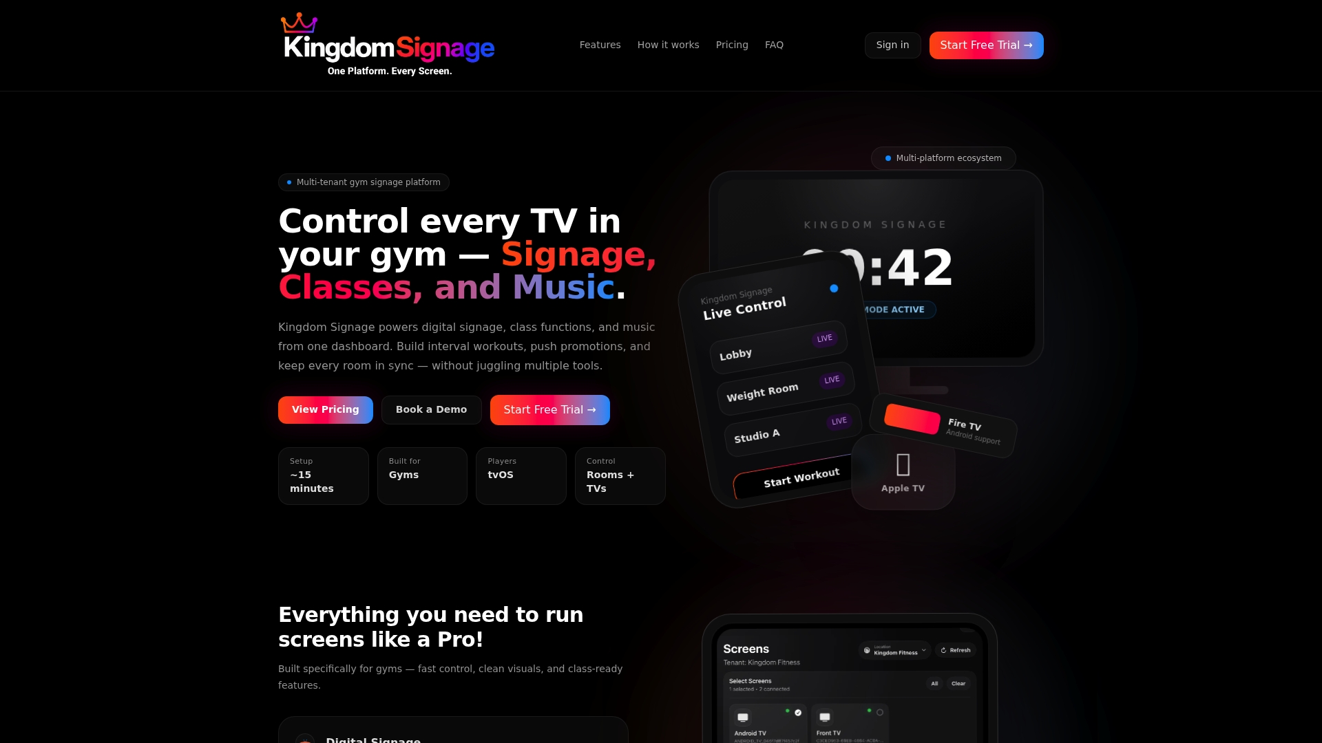
If your gym runs multiple rooms, multiple classes, or more than one location, our platform gives you one dashboard for every screen instead of separate tools for TVs, music, and announcements. Reach out through Kingdom Signage to set up a pilot, test your top languages on two or three screens, and see how real-time updates fit into your existing class schedule before scaling further.
FAQ
Does OSHA require gym safety signs in multiple languages?
No. OSHA does not legally require foreign-language signage, but it encourages employers to post additional-language versions when staff or members can't read English well, and it provides its own poster as a free multilingual download.
What languages should a gym prioritize for signage?
Start with the languages most represented in your membership sign-up data, front-desk observations, and staff fluency, usually two or three languages cover most of the need. There's no universal list since this varies by location and membership base.
Do translated signs still need to meet ADA requirements?
Yes. ADA tactile and Braille requirements for permanent signs, including specific mounting heights, apply regardless of how many languages appear on the sign.
Is digital signage worth it for a small single-location gym?
It depends on how often your messaging changes; a gym with stable classes and few promotions may do fine with printed signs, while frequent schedule or language updates make digital signage pay back faster by avoiding repeated print runs.
How much does translating a sign actually improve understanding?
Design matters as much as translation. A 2026 study found that redesigning signs using the compatibility principle, pairing intuitive pictograms with short text, raised comprehension by an average of about 44.7% over the original designs.
Sources
- OSHA Job Safety and Health Workplace Poster | Occupational Safety and Health Administration
- Reifying ergonomic compatibility in redesign to enhance cross-cultural comprehension of prohibition safety signs | Universal Access in the Information Society (Springer)
- ADA 2010 Standards | U.S. Department of Justice / ADA