
The best bilingual screen messages are short, predictable, and marked so assistive technology and human readers can reliably process either language. Programmatic language tagging, as required under WCAG 2.2, lets screen readers apply correct pronunciation to each passage, while human review remains the baseline for any message tied to safety or compliance. Get those two things right first.
TL;DR:
- Audit actual audience language needs, then provide full translations for safety, emergency, policy, and legal messages; reserve headlines or QR codes for promotional details.
- Use stacked languages on narrow screens, side by side columns only when each has room, and sequential screens rather than shrinking type for long copy.
- Test mixed direction scripts and numerals on the actual signage player, since previews may hide punctuation, alignment, and line spacing errors.
- Store language codes, translator and reviewer details, and publish timestamps with each content variant; set verified fallback messages for failed loads.
- Keep language selection visible with icon and text labels, preserve the source wording for comparison, and let viewers override any suggested default.
Table of Contents
- At-a-glance checklist: quick rules you can apply now
- Designing bilingual messages for screens: typography, contrast, and layout
- Choosing languages and content strategy: who gets shown and why
- Translation and quality-assurance workflows for screen text
- UX patterns: toggles, auto-detect, and preserving the source text
- Accessibility and legal considerations for bilingual screens
- Managing bilingual content in digital-signage systems and workflows
- Testing, measurement, and ongoing maintenance
- Kingdom's perspective: why gyms should plan bilingual screens from day one
- How Kingdom Signage helps manage bilingual messages
- FAQ
- Sources
At-a-glance checklist: quick rules you can apply now
Before you design a single screen, lock in a few operating rules. These keep bilingual copy legible and consistent across a fleet of displays, whether you manage one lobby screen or a chain of facilities.
- Keep on-screen copy short: interpretive-sign guidance favors concise labeling over long passages, since attention drops as text blocks grow.
- Choose a typeface and size that remain readable at the screen's typical viewing distance, with strong contrast between text and background.
- Pick a layout: stacked languages for narrow screens, side-by-side columns for wide displays, or separate rotating screens when space is tight.
- Reserve on-demand translation (QR codes, toggles, printed handouts) for detail that does not need to live permanently on screen.
Designing bilingual messages for screens: typography, contrast, and layout
Typography choices that work for a single language often break under two. A font sized for comfortable reading in English may feel cramped once you add a second script with longer words or different letterforms, so test both languages at the actual screen size and distance before finalizing a template.
Contrast and color follow the same accessibility logic that governs any public display. The US Reclamation sign guide points designers toward accessibility standards like ABAAS and the ADA Standards when setting visual contrast, and that guidance applies just as well to a digital screen as to a printed sign.
Scripts matter too. A left-to-right language paired with a right-to-left one needs deliberate line-spacing and alignment decisions, not a default template stretched to fit. Bidirectional punctuation and mixed-direction numerals can render incorrectly on some signage players, so check actual output on your hardware rather than trusting a preview.
- Stack languages vertically when screen width is limited and reading order matters.
- Use side-by-side columns only when each column has enough width to avoid cramped line breaks.
- Split long bilingual content across sequential screens instead of shrinking type to fit one frame.
Pro Tip: Test your bilingual template on the lowest-resolution screen in your fleet first; if it reads clearly there, it will read clearly everywhere else.
Choosing languages and content strategy: who gets shown and why
Not every message needs every language, and not every language needs full on-screen treatment. Start by figuring out which languages your actual audience speaks, then apply a priority order before you touch layout.
- Audit language needs using visitor surveys, membership data, or local demographic information rather than assumptions.
- Prioritize safety and emergency content for full bilingual treatment first, since GSA language-access policy treats these as mission-critical communications requiring validated accuracy.
- Reserve partial translation (headlines only, or a QR code to a full translation) for interpretive or promotional content where space is limited.
- Route anything requiring nuance, like policy text or legal notices, to full human-reviewed translation rather than a shortened on-screen summary.
When screen space runs out, supplement rather than compress. A printed brochure, a linked portal, or a language toggle can carry detail a screen cannot hold without becoming unreadable.
Translation and quality-assurance workflows for screen text
Short on-screen copy magnifies small translation errors because there is no surrounding context to soften a mistake. A single mistranslated word on a schedule board or emergency notice reads as wrong, not just awkward.
Machine translation can speed up first drafts, but HHS OCR's Section 1557 guidance recommends qualified translators and human review for anything critical, and the same standard applies to safety-related screen content. Build a short style guide that fixes how you handle abbreviations, numeric formats, and tone across both languages, so one screen does not say "9 AM" while another says "09:00."
- Draft with machine translation for speed, then route every public-facing message through a human reviewer before it publishes.
- Maintain a glossary and translation memory so recurring labels (like "Class Schedule" or "Emergency Exit") stay identical across every screen and update.
- Record who translated and who approved each message, with a timestamp, so you can trace and correct errors quickly.
- Version translated content the same way you version the source language, so updates never leave one language stale.
Pro Tip: Build your glossary before your first bilingual campaign, not after; retrofitting consistent terminology across dozens of existing screens takes far longer than setting the rule up front.
UX patterns: toggles, auto-detect, and preserving the source text
Screens that serve mixed-language audiences generally choose between three patterns: showing both languages at once, offering a toggle, or routing viewers to a dedicated screen per language. Each has a tradeoff. Showing both languages works for short, high-priority messages but eats space fast. A toggle preserves space but requires a control simple enough for any viewer to find and use.
Auto-detection sounds convenient, but forcing a language switch based on assumptions (location, time of day) risks hiding the message a viewer actually needs. A better pattern remembers a viewer's prior selection and treats auto-detect as a suggestion, not a replacement.
- Use icon-and-text labels for language controls, not icons alone, since a flag or abbreviation alone can confuse non-technical viewers.
- Keep the original source text available, even behind a toggle, so anyone checking accuracy can compare both versions directly.
- Default to the audience's most common language based on your own audit data, and let viewers override it easily.
Accessibility and legal considerations for bilingual screens
Accessibility compliance for bilingual screens rests on a few overlapping standards. WCAG 2.2 requires that the human language of each passage be programmatically determinable, which is what lets a screen reader switch pronunciation rules correctly between two languages on the same display.

Mission-critical communications, including safety and emergency content, require human-validated language access rather than machine translation alone, according to GSA's language services policy, which permits machine translation for efficiency but requires validation when accuracy matters.
Physical signage carries its own rules worth knowing even for a mostly digital deployment. The Access Board's ADA sign guidance notes that when a sign repeats information in another language, only the English content must meet tactile standards, though visual readability in the other language still matters.
- Tag every passage's language in your content management system, not just the page or template level.
- Follow MUTED-style lettering and size standards when bilingual messages appear on or near physical wayfinding.
- Build emergency message templates in advance, with both languages pre-approved and ready to force onto every screen.
- Timestamp every emergency update so you can confirm when each language variant went live.
Managing bilingual content in digital-signage systems and workflows
Operationally, bilingual signage lives or dies on how your content management system handles language as data, not just as text. A template built around language-tagged fields lets the system pick the right variant automatically instead of relying on someone remembering to swap files.
- Tag every content field with a language code so templates can auto-select the correct variant per screen or zone.
- Group screens by audience and schedule language variants by location or time block rather than manually swapping content.
- Store metadata (translator, reviewer, publish timestamp) with every variant so you can audit what ran and when.
- Build a fallback rule so any screen defaults to a verified message if a variant fails to load.
In facilities running many screens across multiple rooms, like gyms or studios, this matters more than it might seem. We built our platform around exactly this problem: unifying TV displays, class schedules, and room-based audio from one dashboard so an announcement or schedule change syncs across every room and language variant at once, instead of requiring staff to update each screen by hand. Our digital poster playbook for multi-location facilities walks through the same templating logic in more detail.
Testing, measurement, and ongoing maintenance
Bilingual screens need the same ongoing scrutiny as any other critical content, not a one-time launch check. Build testing into your maintenance calendar, not just your initial rollout.
- Run field tests with representative bilingual speakers to confirm messages read naturally, not just grammatically correctly.
- Test with actual screen readers to confirm language tags trigger correct pronunciation rules.
- Track comprehension through simple KPIs: toggle usage rates, incident reports tied to confusing messages, and time-to-correct when an emergency message needs updating.
- Refresh your translation memory and glossary whenever source content changes meaningfully, not just on a fixed schedule.
Pro Tip: Schedule a quarterly review of your bilingual templates alongside your regular signage audit; stale translations are easy to miss until a viewer points them out. Our gym signage upgrade checklist covers the broader maintenance cadence this fits into.
Kingdom's perspective: why gyms should plan bilingual screens from day one
Most gyms treat bilingual signage as an afterthought, something to patch in once a complaint arrives. That is backward. Class transitions, schedule changes, and emergency updates all move faster when audio and visuals sync automatically across rooms, and retrofitting language support into that system later always costs more than building it in from the start.
The practical first step is small: audit which languages your current members actually need, then make sure your templates support tagged variants before your next schedule change, not after.
— Kingdom
How Kingdom Signage helps manage bilingual messages
We built our platform around problems this guide covers: language-tagged templates, scheduling by room or location, and multi-room sync that keeps every screen showing the correct, current variant. 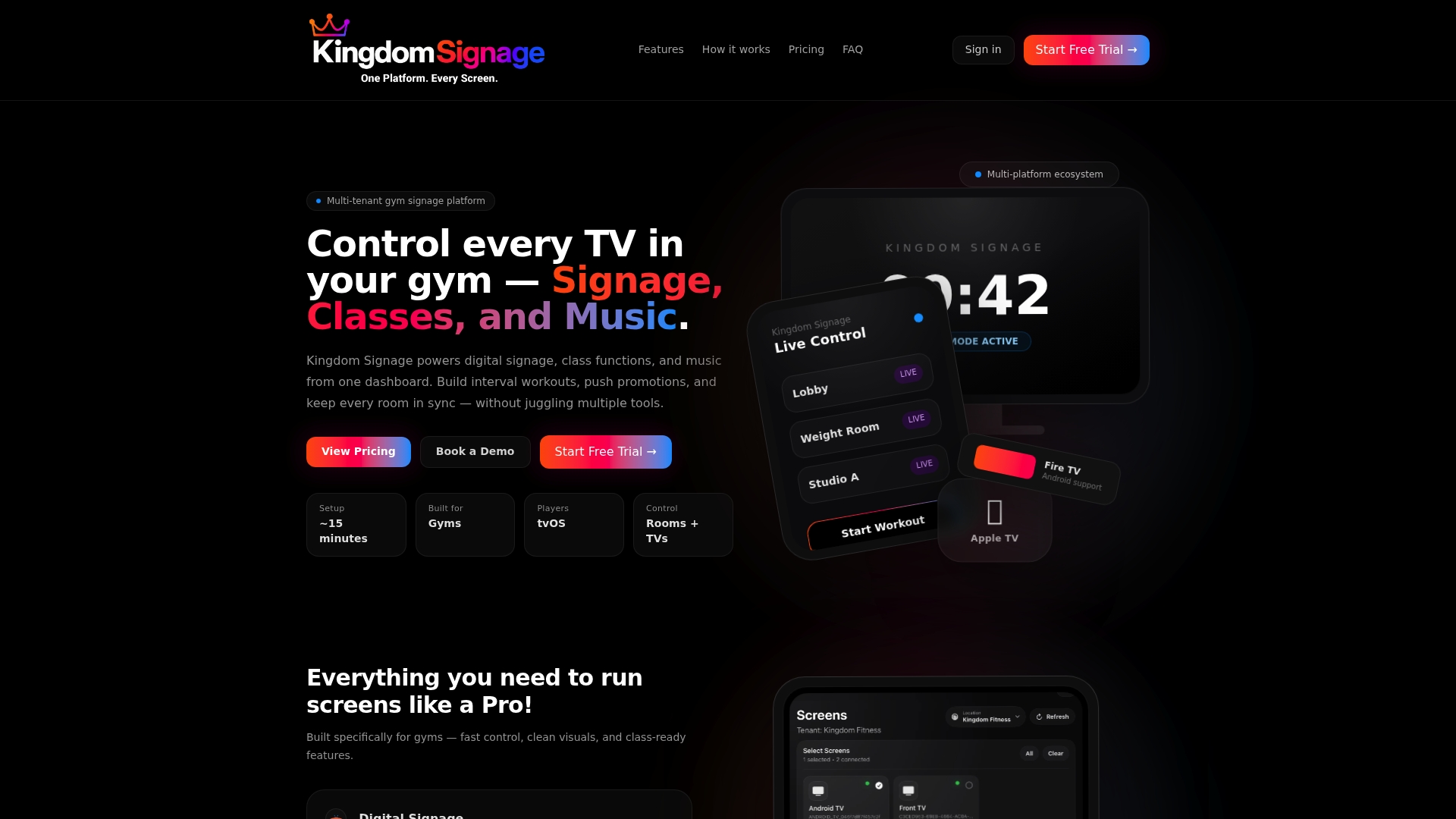
When a class schedule or emergency notice changes, it updates everywhere at once instead of screen by screen, which is where most bilingual signage errors creep in. If you manage screens across multiple rooms or locations, see how listing your property with verified kitchen amenities can benefit your facility on Hotels With Kitchenettes.
FAQ
How do you spell bilingual?
"Bilingual" is spelled b-i-l-i-n-g-u-a-l, with no hyphen. It describes something involving two languages, such as a bilingual sign or a bilingual speaker.
Why are my text messages in a foreign language?
This usually happens when a phone's regional or language settings differ from the sender's, or when a messaging app auto-detects the wrong language and applies translation or display settings incorrectly. Checking your device's language settings and the messaging app's translation preferences typically resolves it.
What are the 8 types of translation?
Translation theory is often grouped by purpose or method, such as literary, technical, legal, and administrative translation, but definitions and counts vary across sources. For on-screen bilingual signage, the categories that matter most are literal, functional, and localized translation, since each affects how closely a screen message should mirror the source text.
What is the importance of bilingualism?
Bilingual communication lets more people access the same information accurately, which matters most for safety, emergency, and service content where misunderstanding carries real consequences. GSA's language access policy treats this kind of access as essential for mission-critical communications specifically because clarity cannot be optional.
Sources
- Web Content Accessibility Guidelines (WCAG) 2.2
- Sign Guidelines for Planning, Designing, Fabricating, Procuring, Installing, and Maintaining Signs for Outdoor Public Use Areas (2026)
- Language access provisions: Section 1557 (HHS OCR)