
Permanent room identifiers, exit stairway signs, and elevator controls must be tactile, mounted 48 to 60 inches above the finished floor, with an 18-inch by 18-inch clear floor space centered on the characters and contracted (Grade 2) braille placed beneath the text. Directional and informational signs are usually visual-only. Digital signage adds a second layer entirely: physical mounting rules still apply, but so does content accessibility for anything displayed on screen. Start your audit by sorting every sign in the building into one of those two buckets.
TL;DR:
- Tactile signs must be mounted between 48 and 60 inches above the floor with an 18-inch by 18-inch clear floor space and include Grade 2 braille below the text.
- Visual-only signs like wayfinding arrows do not require tactile features, but exemptions exist for temporary signs, menus, and addresses.
- Signage involving permanent identifiers, such as room numbers and elevator controls, must have tactile characters, braille, and appropriate contrast, while directional signs do not.
- Digital signage and kiosks need to meet physical reach and mounting rules, along with content accessibility features like captions, high-contrast displays, and alternative operation methods.
- Regular audits should categorize signs, verify technical specifications, and document compliance with measurements, photos, and relevant standards to prevent legal issues.
Table of Contents
- What Are the ADA Signage Requirements for Different Sign Types?
- Tactile Characters, Braille, and Pictogram Rules You Can't Skip
- Where Should Tactile Signs Be Mounted?
- How Big Do Visual Sign Characters Need to Be?
- Does ADA Apply to Digital Signage and Interactive Kiosks?
- Building Your ADA Signage Compliance Checklist
- Official ADA Signage Standards and Guidance to Bookmark
- A Publisher's Perspective on Signage Compliance in Gyms
- How Kingdomsignage Keeps Your Displays Accessible and On-Brand
- Sources
What Are the ADA Signage Requirements for Different Sign Types?
Not every sign in your building needs braille and raised letters. The U.S. Access Board's Chapter 7 guidance draws a sharp line between signs that identify a permanent space and signs that merely give directions or information, and that line determines your entire budget for signage compliance.
Tactile signs are required for anything that permanently labels a room or space a visitor needs to locate and confirm by touch. That means:
- Interior and exterior room and space identifiers that won't change (restrooms, "Room 204," "Electrical Closet")
- Exit stairway identification signs and exit discharge labels
- Elevator car controls and elevator hoistway signage
- Accessible parking signs, which also require the International Symbol of Accessibility and must have their bottom edge mounted at least 60 inches above the ground — a painted symbol on the pavement never substitutes for the above-ground sign.
Visual-only signs cover directional and informational content: wayfinding arrows, "Cafeteria This Way," building directories, and floor maps. These need legible characters and strong contrast but not raised text or braille, because they describe a route rather than confirm a specific destination.
Common exemptions let you skip tactile treatment entirely for a handful of categories: temporary signs posted for seven days or fewer, signs bearing an occupant's name or company logo, menus, addresses, and building directories. A construction area sign or a "Grand Opening Friday" banner doesn't need braille.
The trickiest calls involve mixed-content signs, a directory panel with a permanent room number stamped on it, for instance. The rule of thumb: any element that functions as a permanent identifier gets tactile treatment, even if it sits on a sign that's mostly informational. One misconception costs facilities real money: assuming every sign in the building needs braille. In practice, the Access Board's own guidance confirms exemptions exist precisely so organizations can focus resources on the signs that matter most for wayfinding and egress, not spread thin across every wall placard in the lobby.
Tactile Characters, Braille, and Pictogram Rules You Can't Skip
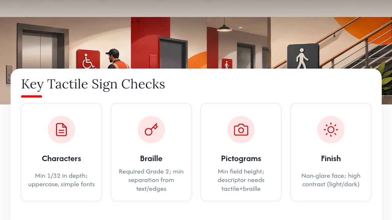
Tactile signage lives or dies on a handful of numbers, and vendors get them wrong constantly. Raised characters need a minimum depth of 1/32 inch above the background, and they must be uppercase, sans-serif or simple serif, without italics, oblique, or highly decorative strokes. Character height generally varies depending on viewing distance, and stroke width, spacing between characters, and spacing between lines of text all have defined limits in the Standards' 703 series.
Braille is non-negotiable for tactile signs, and it has to be contracted, meaning Grade 2 braille, not the letter-by-letter Grade 1 version many first-time vendors quote. Braille dots sit below the corresponding raised text with a minimum separation from the characters above and from the sign's edges, which is why cramming braille and tactile text onto an undersized sign blank is one of the most common fabrication mistakes. The Access Board's ABA guide spells out these separation distances in detail, and it's worth having your sign vendor confirm compliance in writing before production.
Pictograms follow a separate rule. When a symbol (a restroom icon, for example) labels a permanent room, the pictogram field itself must measure at least a certain minimum height, and any verbal descriptor beneath it needs its own tactile and braille treatment if the pictogram is the primary identifier. A tiny wheelchair icon squeezed into a corner of a nameplate doesn't meet that threshold.
Finish and contrast rules round out the technical picture. Sign faces need a non-glare finish, and characters must contrast with their background, either light characters on a dark field or dark characters on a light field. The Standards don't assign a specific numeric contrast ratio for tactile signs the way some digital accessibility standards do, but inspectors consistently flag low-contrast combinations (gray on gray, for instance) during walkthroughs, so err toward higher contrast rather than a subtle brand-matched palette.
Where Should Tactile Signs Be Mounted?
Placement fails more inspections than character design does, mostly because door hardware, trim, and adjacent fixtures eat into the space the Standards require. Here's the sequence to follow on every door:
- Measure the mounting height first. Tactile characters must sit between 48 and 60 inches above the finished floor, measured to the baseline of the characters themselves, not the sign panel's edge.
- Confirm the clear floor space. An 18-inch by 18-inch clear area must be centered on the tactile characters, and that space has to sit outside the arc of any door swing so a person reading by touch isn't standing in the door's path.
- Check latch-side placement. Signs generally mount on the wall adjacent to the latch side of the door, not on the door itself, since a sign on a swinging door is unreadable half the time.
- Flag double doors and tight corridors. When there's no latch-side wall space, or when two doors sit close together, the permitted fix is relocating the sign to the nearest adjacent wall rather than forcing it into a non-compliant spot.
- Document every deviation. If a hallway's dimensions genuinely won't accommodate standard placement, photograph the constraint, measure the available space, and record the Standards section you're relying on to justify the alternate location. That paper trail is what protects you if the placement is ever questioned.
Facilities teams that skip step five are the ones who end up scrambling during a complaint investigation. A photo and a citation take five minutes on-site; reconstructing that justification a year later from memory does not.
How Big Do Visual Sign Characters Need to Be?
Visual signage compliance comes down to one relationship: character height scales with how far away a person needs to read it from, and the Standards' tables in Section 703.5 translate that relationship into concrete minimums. A sign mounted low and read up close can use smaller text than an overhead directional sign meant to be legible from across a lobby.
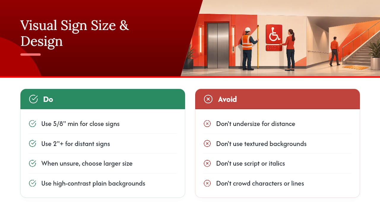
As a working rule of thumb: signs mounted at typical eye level for close reading can use characters as small as 5/8 inch, but anything mounted higher, or intended to be read from farther away, needs proportionally larger text, often 2 inches or more for overhead or long-distance signage. When in doubt, oversize rather than undersize; a slightly larger character has never failed an inspection, while an undersized one fails constantly.
Contrast matters just as much as size. The Standards don't hand designers a specific contrast ratio number for visual signs, but the practical guidance is consistent: go for strong, high-contrast combinations and steer clear of busy or textured backgrounds that make characters swim visually, even when they technically pass a contrast check. A brushed-metal sign face with etched gray-on-gray lettering might look sleek in a rendering and still be nearly unreadable in a dim hallway.
On fonts, the same rules that govern tactile characters largely carry over to visual-only signs: use simple sans-serif or serif fonts, avoid italics and script styles, keep stroke thickness proportional to character height, and give characters and lines enough breathing room that words don't blur together at a glance. Architects and designers often want to match signage typography to a brand's custom font. That's fine for a lobby wall graphic. It's a liability for a code-required sign.
Does ADA Apply to Digital Signage and Interactive Kiosks?
Yes, and the requirements split into two categories that too many facilities teams only address one of. Physical accessibility covers the same mounting and reach logic as static signs: a kiosk or touchscreen has to sit within reach range for a seated user, and the approach in front of it needs clear floor space free of obstructions.
Content accessibility is the part that catches gyms, retail chains, and hospitality operators off guard, because it has nothing to do with hardware and everything to do with what's actually displayed. That includes:
- Captions or on-screen text for any audio or video content playing on a public-facing screen
- Fonts and contrast on digital displays that meet the same legibility logic as printed signs
- Alternative access methods for anyone who can't operate a touch interface, whether that's a physical button, a voice option, or staff-assisted access
- Interfaces that align with WCAG principles even though WCAG itself is a web standard rather than an ADA signage rule
For touch controls specifically, the Standards allow operable reach up to 48 inches in some configurations, but plenty of practitioners deliberately design a kiosk's primary active controls closer to 40 inches. That lower target improves usability for seated users and cuts down on abandoned interactions, even when the higher limit would technically pass.
Pro Tip: Run a "silent test" on every digital display before it goes live: mute the sound entirely and watch the content for sixty seconds. If you can't understand what's happening without audio, a Deaf or hard-of-hearing visitor can't either, and that screen needs captions before it's approved.
Kiosks and lobby screens are also becoming a real litigation exposure point, and the documented best practice is proactive auditing: check both the physical installation and the on-screen content on a recurring schedule, not just at launch. A facility that installs an interactive directory and never revisits its content settings is the exact profile that draws complaints.
Building Your ADA Signage Compliance Checklist
An audit only works if it's sequenced correctly. Life-safety signage comes first, cosmetic fixes come last, and every finding gets documented the same way so you're not reinventing your process sign by sign.
- Inventory every sign in the building and tag each one as tactile-required, visual-only, or exempt, using the scope rules above as your filter.
- Measure mounting height and clear floor space on every tactile sign, photograph each measurement, and note the specific Standards section it satisfies or violates.
- Check braille grade, pictogram sizing, and finish/contrast against the technical specs, flagging anything that looks like Grade 1 braille or an undersized pictogram field.
- Rank findings by risk, putting exit signage, elevator controls, and accessible parking signs at the top of the remediation list, since these carry the highest life-safety and legal exposure.
- Write vendor specifications that cite the standard directly (mounting height, braille grade, character depth) rather than relying on a vendor's own "ADA compliant" label, which varies wildly in what it actually verifies.
- Schedule a re-check at a fixed interval, since new construction, renovations, and replaced signage all create fresh compliance gaps.
Consistent documentation is the difference between a routine correction and a costly one; see this example accessibility statement for a model of documenting accessibility policies in a facility. When a facility can show measured mounting heights, dated photographs, and the exact Access Board citation behind each installation, a complaint investigation moves fast and usually ends there. Without that paper trail, the same investigation drags on and often escalates.
Official ADA Signage Standards and Guidance to Bookmark
Every claim in this guide traces back to a normative federal source, and you should keep these bookmarked for procurement, design review, or a legal defense.
- The Access Board's Chapter 7 guide to signs is the plain-language explanation of scoping and technical rules, best for quick reference during a walkthrough.
- The Access Board's Chapter 7 Standards excerpt contains the actual numbered technical provisions (703.2 through 703.5) that vendors and architects should cite in specifications.
- The ABA Guide PDF covers braille grade, pictogram sizing, and the exemption categories in detail.
- Ada is the Department of Justice's normative baseline, the document that governs enforcement for new and altered construction.
The Access Board documents are technical guidance meant to interpret the Standards; ADA.gov's published Standards are the enforceable legal text itself. When the two appear to conflict on a fine point, the Standards on ADA.gov control.
A Publisher's Perspective on Signage Compliance in Gyms
Most gym operators think of ADA signage as a one-time install, get the wayfinding signs made, mount them, move on. That mindset breaks down the moment a facility adds digital displays, because content changes weekly and physical signage doesn't.
Centralized control over what appears on a facility's screens is the single biggest lever for catching accessibility failures before a member does. When class schedules, promotions, and announcements all route through one dashboard instead of a dozen disconnected devices, someone can actually review captioning and contrast consistently, rather than hoping every room manager remembers on their own.
The workflow that works: build content templates with captioning and contrast baked in from the start, test every new layout on a dummy account before it goes live facility-wide, and re-check digital displays on the same schedule as physical signage audits. Treat your screens as another item on the inventory in Building Your ADA Signage Compliance Checklist above, not a separate system living outside the compliance process.
— Kingdom
How Kingdomsignage Keeps Your Displays Accessible and On-Brand
Kingdomsignage gives gym operators a way to manage screen content the way this guide recommends managing physical signs: one dashboard, consistent templates, no guessing which room is running an outdated or non-compliant screen.
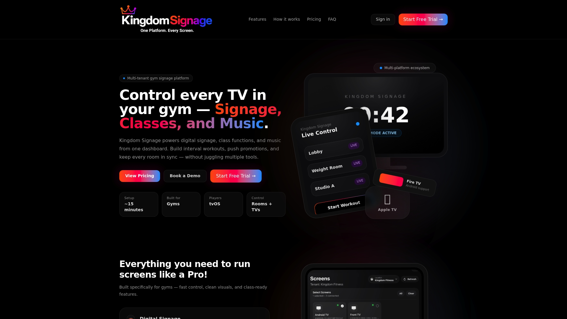
The platform centralizes captions, layout adjustments, and multi-room scheduling so a compliance fix made once applies everywhere, instead of getting rebuilt room by room. You can push a corrected caption template, a higher-contrast layout, or an updated class schedule to every screen across every location from a single control point, which is exactly the kind of consistency an ADA content audit is looking for. For a facility running a dozen studio screens and lobby displays, that's the difference between a five-minute update and a five-location fire drill.
If you're mapping your digital signage against the checklist in this guide, Kingdomsignage is worth a look before your next audit cycle. Request a demo to see how the dashboard handles captioning, scheduling, and multi-room control, and get a head start on your next accessibility review.